
A brand isn’t colors—it’s consistency.
When I launched Elevatus, I didn’t sit on the sidelines waiting until everything looked flawless. I didn’t spend months tweaking fonts or hiring a design agency to build something glossy. Instead, I leaned into my background — years as a formal training instructor and my experience in emotional intelligence development. Those two things shaped how I saw branding.
As an instructor, I learned the power of structure, clarity, and repetition. As someone trained in emotional intelligence, I understood how feelings shape decisions before logic even arrives. That combination became the foundation of Elevatus’ brand identity. My goal wasn’t decoration. It was teaching trust and creating connection through psychology and consistency.
Origin Story
Elevatus was born out of a personal and professional truth: you don’t start over after setbacks — you rise from them. That became the heartbeat of the brand. I wanted Elevatus to carry that lesson in everything — from the frameworks I share to the very logo itself.
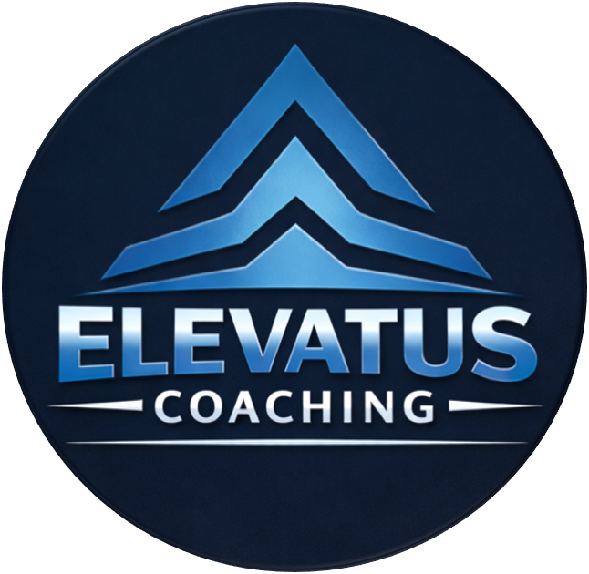
That’s why the brand symbol is more than a shape. It’s three stacked mountains with an arrow pointing upward. To most, it looks simple. To me, it’s a roadmap. The three peaks represent stages of growth. The arrow is momentum. Together, they say what I tell every client: you don’t reset life, you climb higher.
Then came the colors. I didn’t pick them just because they looked nice together. I chose them because they carry meaning that people feel before they ever read a word:
Dark Navy Blue for clarity and trust. It’s solid, steady, and communicates reliability.
Clay for grounding and resilience. It’s earthy, warm, and human — a reminder that growth is rooted in reality.
Gold for elevation and achievement. It signals rising higher and celebrating the climb.
This palette wasn’t random. It was designed to communicate trust, stability, and growth instantly — a subtle way of teaching emotional connection through psychology.
The Problem to Solve
At launch, Elevatus had no time to waste. I didn’t have a huge budget or an army of designers. What I did have was a need to earn trust quickly. People had to understand what Elevatus stood for and why it mattered.
The challenge wasn’t, “How do I make this brand look fancy?” The real challenge was, “How do I help people feel safe, supported, and elevated right away?”
That’s where my instructor’s discipline and my emotional intelligence training worked together. I knew consistency builds trust because it builds reliability. I also knew that color, tone, and symbols tap into feelings that bypass logic and go straight to the heart. By combining both — structure and emotion — Elevatus could connect with people faster than visuals alone ever could.
The Lessons
Building Elevatus this way gave me some clear takeaways:
Voice before visuals. The way I spoke about transformation — with structure, clarity, and empathy — built my brand faster than any design.
Psychology over polish. Dark navy, clay, and gold weren’t just pretty. They were trust signals, rooted in both research and emotional intelligence.
Consistency creates authority. By showing up with the same message, tone, and framework, I became reliable in people’s minds — and reliability is the real currency of trust.
Reflection
Looking back, my first draft wasn’t flashy. It didn’t scream “professional agency branding.” But it was intentional, and that’s what made it powerful. My background as a formal training instructor taught me to value clarity and repetition. My work in emotional intelligence reminded me that people trust those who connect to both head and heart.
That’s why Elevatus gained traction so quickly. The logo carried meaning. The colors created feelings. The voice stayed steady. And the consistency made it stick. Together, those pieces taught trust long before anyone booked a call or clicked a link.
Here’s the funny part: people often think brands are built on aesthetics. But an “ugly” yet consistent brand will always outperform a beautiful but inconsistent one. Consistency isn’t glamorous, but it works.
Call to Action
If you’re waiting for your brand to look flawless before you launch, you may be waiting forever. People don’t buy polish. They buy trust. They buy meaning. They buy the consistent voice that helps them feel safe and capable of moving forward.
Start with psychology. Choose symbols and colors that say what you want people to feel. Bring in emotional intelligence to make sure your voice connects with both the head and the heart. Then show up again and again until your message becomes unforgettable.
That’s how I built Elevatus in weeks, not years.
And it’s the same process I share inside Discovery Advantage. It’s the system I used to launch Elevatus lean, intentional, and fully operational in one month — without ads, a big following, or perfect visuals. If you want to build trust and visibility with the same momentum, Discovery Advantage is where to start.
🔄Did you find this article helpful? Share it!

About the Author - Danny DeJesus
Danny De Jesus is a transformational resilience thought leader, strategic thinker, and the founder of Elevatus Coaching—a practice built to help people rebuild their lives after major change. Drawing from his own experiences with divorce, co-parenting, and career shifts, he created the C2R2E Framework to guide people from collapse to elevation with clarity and confidence. Through the Elevatus Blog, he shares insights for anyone navigating disruption, rebuilding direction, or shaping a new chapter with purpose.